
The Repeat Visit Curves report shows how quickly first-time clients come back, broken down by segment.
It answers: of the new clients who first visited in this period, what share returned, how fast and which segments retain best? It's a chart dashboard, not a client list.
How to find it
Step 1: Navigate to the Analytics Feature
Log in to your Pabau account, and in the left sidebar menu, go to Analytics, then click on the "Reports" button.
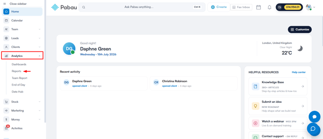
Step 2: Access the reports banner
On the "Try our new suite of reports" banner, click Try it now.
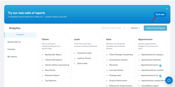
Once you're in the new reports view, go to the Clients section then scroll to the "Diagnose & compare" group and click on Repeat Visit Curves by Segment to open the report.
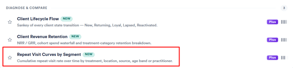
NOTE: Repeat Visit Curves by Segment carries "New" and "Plus" badges in the catalog, and also appears under the Featured tab of the reports view.
Filters
- First Visit Date – The window a client's first visit must fall in. Maximum 365 days.
- Locations – Exactly one location.
- Min Cohort Size – 10+ / 20+ / 30+ / 50+ clients (default 30). Segments smaller than this are excluded.
- Horizon – 90 / 180 / 365 days (default 365) — how far the curve extends.
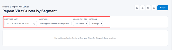
Understanding the report
The KPIs
Five KPI cards at the top summarise the segments currently shown on the chart:
- Best segment · 90-day return – the segment with the highest share of clients back by day 90.
- Worst segment · 90-day return – the segment with the lowest share back by day 90.
- Spread (best − worst) – the gap between those two, in percentage points.
- Median · day 30 – the median day-30 return rate across all visible segments.
- Median · day 90/180/365 – the median return rate at the end of your selected horizon — the long-run repeat rate.
The KPIs react to what's visible, so hiding a segment from the chart updates them.
How to read the curves
Each curve runs from day 0 (first visit) rightward. The line shows the cumulative % of the cohort who have come back at least once by that day.
NOTE: A return must be on a later calendar day — a second appointment on the same day doesn't count.
Use the Compare by tabs to switch the breakdown between five segment types: First treatment, Location, Acquisition source, Age group, and Practitioner (the practitioner who saw the client at their first visit).
NOTE: Age bands are 18–24, 25–34, 35–44, 45–54, and 55+. Missing/implausible dates of birth and under-18s go into an "Unknown" band, which is still shown.
Click a segment in the chart legend to hide or show its curve — a Show all/Hide all button resets everything. You can also turn on Show confidence band to draw an indicative interval around each curve; the band is wider for smaller segments, where the rate is less certain.
The Segment scorecard
Below the chart, the Segment scorecard table lists every segment, sorted by day-90 return rate. Segments you've hidden from the chart stay in the table, marked "hidden."
| Column | Meaning |
|---|---|
| Clients | Cohort size (segments below the minimum are excluded). |
| D30 / D90 | Share who had returned by day 30 / 90, each with a ± percentage-point tag showing how far the segment sits above or below the median. |
| D90 / D180 / D365 | Share who had returned by the end of your selected horizon (the column matches the Horizon filter). |
| Avg visits / 365d | Average visits per client in their first year, including their first visit. |
| Avg revenue / 365d | Average spend per client in their first year, shown as an amount with a comparison bar. |
At the bottom of the report, a "Reading the curves" card recaps the key rule: curves are cumulative — once a client returns they're counted in every later day — the plateau is the long-run repeat rate, and steeper rises mean clients coming back faster.
With this understanding, you can confidently use the Repeat Visit Curves report to see how quickly new clients return, and which segments are retaining best.
Was this guide helpful? Let us know by voting below - your feedback helps us write clearer articles.
For more guides, browse the related articles below or use the search bar at the top of the page. You can also watch our video learning series, the Pabau Academy, or visit the Support page for additional help.