
This feature is part of the new client card version and is currently available to select users only, starting August 2026. A wider rollout to all accounts is coming soon.
The Client Journey gives you a one-glance picture of a client’s history with your business. It plots every appointment, package purchase and membership on a single rising curve, so you can instantly see how engaged a client such as Emma Thompson has been — when she visited regularly, when things went quiet, and what she purchased along the way — with her progress photos floating above the timeline.
You’ll find the journey in the Summary tab of the new client card. This guide shows you how to open it, read the curve and its markers, switch between the one-year and five-year views, and use the progress-photo thumbnails.
1. Open the client card
- Search for the client you’d like to review — for example, Emma Thompson — and open their client card.
- Make sure you’re on the Summary tab, which gives you an overview of the client’s record.
2. Open the Client Journey
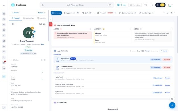
- On the Summary tab, locate the Appointments widget.
- In the widget’s header, next to the client’s last visit and upcoming appointment count, click the Journey button.
- The Client journey window opens over the client card.
NOTE: The Journey button appears once the widget has finished loading. It’s available even when the client has no appointments yet, so you can still review a history made up of packages or memberships only.
3. Read the journey curve
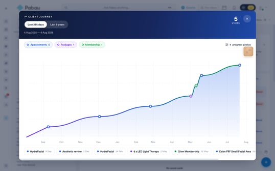
The window is built around a single cumulative curve of the client’s activity:
- Time range and dates — in the top left you’ll see the Last 365 days / Last 5 years selector, with the exact dates covered shown just beneath it.
- Visits — the large figure in the top right counts the appointments the client actually attended within the selected period. Cancelled and no-show appointments are not included.
- The curve — it starts at the baseline and steps upwards each time something happens: every attended appointment, package purchase and membership lifts it one step. Steep sections show periods of frequent activity, while flat stretches show quiet spells.
- The axis — along the bottom, the chart is labelled by month in the 365-day view and by calendar year in the 5-year view.
Tip: The Visits figure is deliberately stricter than the curve. The curve rises for every kind of activity, including purchases, whereas Visits counts attended appointments only — so it’s the number to quote when you want to know how often the client has actually been in.
4. Understand the markers and legend
Each event sits on the curve as a coloured marker:
- Blue — an appointment, placed on the date it took place.
- Red — a cancelled or no-show appointment. It sits on the curve at its date but doesn’t lift it, and it isn’t counted in the Visits figure.
- Purple — a package, shown on the date it was activated.
- Green — a membership, shown from its start date.
- Hover over any marker to see what it is — a tooltip shows the event’s name (for example, the service booked) and its date.
- Use the legend above the chart to see the totals for the selected period: the Appointments count is always shown, while the Packages and Membership counts appear only when the client has at least one within the period.
5. Switch the time window
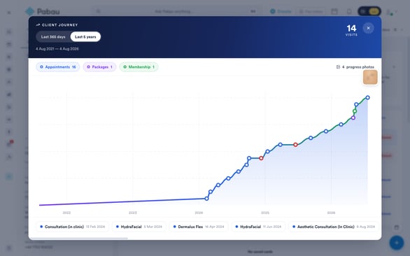
- The journey opens on Last 365 days, which is ideal for reviewing recent engagement month by month.
- Click Last 5 years to zoom out to the long-term view. The switch is instant — nothing reloads.
- The dates beneath the selector, the Visits figure, the legend counts and the axis labels all update to match the wider window, and each event’s date gains its year.
NOTE: If the chart shows No activity in this period, try switching to Last 5 years — the client’s history may simply sit further back than the last year. If you see Journey could not load — please try again instead, close the window and reopen it.
6. View progress photos on the timeline
- Small photo thumbnails float above the curve on the dates the client’s progress photos were taken, so you can line up how they looked against their visit history.
- One thumbnail is shown per day on which photos were taken. For photo-heavy histories, a representative spread of thumbnails is shown so the chart stays readable.
- The badge above the chart shows how many progress photos fall within the selected period — a plus sign (for example, 36+) means there may be more beyond those counted.
- Click any thumbnail to open the full-size photo in a new browser tab.
7. Browse the event list
- Below the chart you’ll find a strip listing every event in the selected period in date order.
- Each entry shows a coloured dot matching the marker colours above, the event’s name — the service, package or membership — and its date.
- Scroll the strip horizontally to move through a busy history.
8. Close the journey
- Click the X in the top-right corner, click anywhere outside the window, or press Esc on your keyboard.
- You’ll return to the Summary tab exactly as you left it.
The Client Journey is the quickest way to gauge a client’s engagement before they walk in — a few seconds with the curve tells you whether they’re a regular, a lapsed client worth re-engaging, or brand new to your business.
Was this guide helpful? Let us know by voting below - your feedback helps us write clearer articles.
For more guides, browse the related articles below or use the search bar at the top of the page. You can also watch our video learning series, the Pabau Academy, or visit the Support page for additional help.