Step 1: Access "Capture Forms"
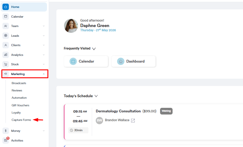
Start by logging into your Pabau account using your login credentials. Then, navigate to the Marketing section located on the left sidebar menu and click to expand it. The "Capture Forms" tab will be revealed.
Step 2: Access Form Builder
To access the form builder, you can either create a new form or view edit an existing one by navigating to the "Forms" tab on the top left corner to view your created forms. On the form you want to configure the settings, click the "Actions" button to view all available options.
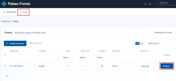
To start editing the form, select the "Update" option.

Step 3: Click the Form Field
When viewing the template on the form builder step, navigate to the field that you would like to edit and click it to reveal the available actions.

Step 4: Edit Form Fields
When clicking the form field, the following actions will be displayed:
Input Type
This defines the kind of field you're using — like text, dropdown, checkbox, or radio buttons. It controls how the client will input their answer.
Pabau Fields
These are mapped to existing fields in the client’s record. Linking them means the data entered will automatically update their profile in Pabau.
Label
This is the title or name of the field that the client sees — for example, "First Name" or "Mobile Number." You can edit the field name from here.
Placeholder
The text you enter here is the light grey text that appears inside the field before the client starts typing — used to give them an idea of what to enter, like "e.g. John."
Predefined Value
The text you enter here is the default value that will already appear in the field unless the client changes it. Handy for common answers or suggestions.
Help Text
You can add extra information and it's shown below the field to guide the client.
Help Text Placement
This lets you choose where the help text appears — either above or below the input field.
-
Above is useful when you want to guide the client before they start typing.
-
Below works well for additional notes or clarifications after they’ve seen the field label.

When scrolling down, more editing options will appear.
Prepend and Append let you add symbols or text before (prepend) or after (append) a field's input box. These are typically used to give context to the information you're asking for.
Here’s how they work:
-
Prepend: Adds something at the start of the input box.
Example: If you're asking for a price, you might prepend it with £ so it shows up like £ [___]. -
Append: Adds something at the end of the input box.
Example: If you're asking for weight, you might append it with kg, so it looks like [___] kg.
Min Length and Max Length let you control how short or long the input in a text field can be:
-
Min Length: The minimum number of characters the client must enter.
Example: Set it to 10 if you want them to write at least a few words in a message field. -
Max Length: The maximum number of characters they’re allowed to type.
Example: Set it to 100 if you want to keep answers short and focused.
Pattern is used to set a specific format that the input must follow — using something called regular expressions (regex).
If the input doesn't match the pattern, the client will see an error and won’t be able to submit the form until it's fixed.

Additional options that show are:
CSS Class
This styles the input field itself. form-control is a common class that makes fields look clean and consistent with the rest of the form design.
Label CSS Class
This styles the label (the text above or beside the field). form-label ensures it’s formatted properly and matches the overall form style.
Input Group CSS Class
This is used when your input is part of a group (like if you prepend or append text/icons). It helps style grouped elements nicely together in one row.
Container CSS Class
Controls the width of the field container in a grid layout.
Example:
-
col-4= one-third of the row -
col-6= half the row -
col-12= full width
Alias
This is a unique internal name for the field — helpful for identifying it in backend systems, especially if you want to reference it in automations or reporting.

Field Options (Choose from)
These settings appear at the bottom and let you control how the field behaves:
- Required – The client must fill this out before submitting the form.
- Read Only – The client can see the info but can’t edit it.
- Disabled – The field is grayed out and not usable at all.
- Unique – Ensures that no one else can submit the same value for this field (great for things like ID numbers or emails).

Step 5: Save Changes
To apply your changes, click the "Save" button, your updates will then be reflected in the form template.
By following these steps, you’ll be able to easily customize and edit the form fields within your templates.
For more guides, refer to related articles below, select additional guides, or use the search bar at the top of the page. These guides will help you get the most out of your Pabau account.
Additionally, to help you fully utilize and understand your Pabau account, we recommend exploring additional guides and resources offered at the Pabau Academy. It offers in-depth video tutorials and lessons, offering a holistic learning experience that can equip you with the essential skills for achieving success with Pabau.