Table of Contents:
1. How to Create Forms Using Capture Forms
1.1. How to Add Form Fields
1.2. How to Edit Form Fields
1.3. How to Add/Edit the Name of Your Form
1.4. How to Edit Your Created Forms
1.5. How to Design Your Form
2. How to Add Forms to Your Website
3. Where to Track Form Submissions
3.1. How to Filter Submissions
3.2. How to Configure Columns
3.3. How to Bulk Edit Submissions
4. How to Configure Your Form Settings
5. How to Add Conditional Logic to Your Forms
NOTE: Capture forms are primarily used for inquiry-stage lead capture and non-medical data collection. If you are looking to collect clinical or patient intake information for existing or registered clients, please refer to the Medical Forms guide.
Capture Forms is a powerful new tool built into Pabau that helps you gather the right information at the right time. Whether you're working with leads, new clients, or anyone in between. It’s designed for non-medical data collection, giving you more flexibility without impacting the client’s clinical records.
Here's what you can do with capture forms in Pabau:
- Customize Your Forms
Tailor every form to suit your business. Whether you need a quick contact form or a detailed questionnaire, you can easily build forms that look and feel just right for your brand. - Add Forms to Your Website or Landing Pages
Place your forms exactly where they need to be, no tech headaches involved. Clients and leads can fill out forms on your site without being taken somewhere else. - Track Submissions and View Form Performance
Keep tabs on how your forms are doing. See who submitted what, measure engagement, and use real-time data to adjust and improve. - Let Clients Upload Files with Ease
Need photos, documents, or proof of ID? Clients can upload them directly through the form, making it ideal for onboarding, consultations, or compliance.
How to Create Forms Using Capture Forms
Step 1: Access "Capture Forms"
Start by logging into your Pabau account using your login credentials. Then, navigate to the Marketing section located on the left sidebar menu and click to expand it. The "Capture Forms" tab will be revealed.

Step 2: Create a New Form
You will be redirected to the Capture forms page, and to get started, click the “+ Create new form” button at the top right of the screen.

Additionally, you can navigate to the "Forms" tab at the top left corner of the screen. You'll find the “+ Create new form” option on the left corner.

Step 3: Choose Your Form Type
Now you’ll view the form creation screen, where you can choose how to begin:
1. Blank Template
Choose this option if you’d like to build your form from scratch.
You’ll be taken directly into the drag-and-drop form builder, where you can add and customize every field to fit your specific workflow.
This is perfect if you need something more tailored or want full control over what’s included.

2. Use a Pre-Built Template
To save time, select one of our ready-made templates. These come with fields already added and mapped to the correct areas in Pabau. You can still rename and adjust anything to make it your own.
Here are the templates currently available:
Lead Capture Template:
A quick and simple form to gather information from potential clients and new leads.Form Type: Leads
Fields included (all required):
-
First Name
-
Last Name
-
Email
-
Mobile Number
-
Your Enquiry
This is ideal for website inquiries, ads, or lead campaigns.

Lead Capture /w Photo Uploaded Template:
Perfect for collecting high-quality leads while allowing clients to share a photo of their concern or area of interest — ideal for consultations that require visual context.
Form Type: Leads
This template includes the same fields as the Lead form template above, with the added option for clients to upload a photo.
You can of course edit the field labels, adjust options, or add extra questions to make the form fit your clinic’s needs.

New/Existing Client Registration Template:
Perfect for onboarding new clients or updating details for existing ones.
Form Type: Clients
Fields included:
-
First Name (required)
-
Last Name (required)
-
Email (required)
-
Gender (radio buttons: Male, Female, Other)
-
Mobile Number
You can edit the field labels, adjust options, or add extra questions to make the form fit your clinic’s needs.

Online Consultations Template
Perfect for collecting higher-quality leads and gathering important information before a virtual consultation.
Form Type: Leads
Fields included:
-
First Name (required)
-
Last Name (required)
-
Email (required)
-
Mobile Number
-
Message
You can edit the field labels, adjust options, or add extra questions to tailor the form to your consultation process.

Image Upload Template:
Perfect for existing clients to securely upload photos related to their treatment, progress, or concerns — making follow-ups and ongoing care more efficient.
Form Type: Clients
Fields included:
-
First Name (required)
-
Last Name (required)
-
Email (required)
-
Mobile Number
-
Message (required)
- Attach a File (required)
You can edit the field labels, adjust options, or add extra questions to tailor the form to your consultation process.

Step 4: Create Forms
Once you have customized your form, click the "Save Form" button located at the bottom of the page to finalize.
After you've selected "Save Form," a modal window will appear with 4 options:
- Continue editing the form
- Go to Advanced Form Settings
- Share form
- Go to Form Manager
In this case, select the 4th option to finalize.

NOTE: If you close the modal window without choosing one of these three options, when you "Save" again, you create another form and not edit the already created. This option can be useful if you want to create several similar forms quickly.
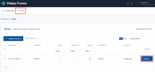
To view your created forms, navigate to the "Forms" tab at the top of the screen.

By following these steps, you can easily create forms using the Capture Forms feature in Pabau.
How to Add Form Fields
Step 1: Create a New Form
To get started, click the “+ Create new form” button at the top right of the screen.
Step 2: Choose Your Form Type
Select your preferred form type from the available options. In this case, we’ll choose a pre-defined template like New/Existing Client Registration.

Step 3: Add Form Fields
To add more form fields, navigate to the left-hand side where all available fields are listed, then simply drag and drop your chosen field into the main form template.

By following these steps, you can add fields to your forms.
How to Edit Form Fields
Step 1: Click the Form Field
When viewing the template on the form builder step, navigate to the field that you would like to edit and click it to reveal the available actions.
Step 2: Edit Form Fields
When clicking the form field, the following actions will be displayed:
Input Type
This defines the kind of field you're using — like text, dropdown, checkbox, or radio buttons. It controls how the client will input their answer.
Pabau Fields
These are mapped to existing fields in the client’s record. Linking them means the data entered will automatically update their profile in Pabau.
Label
This is the title or name of the field that the client sees — for example, "First Name" or "Mobile Number." You can edit the field name from here.
Placeholder
The text you enter here is the light grey text that appears inside the field before the client starts typing — used to give them an idea of what to enter, like "e.g. John."
Predefined Value
The text you enter here is the default value that will already appear in the field unless the client changes it. Handy for common answers or suggestions.
Help Text
You can add extra information and it's shown below the field to guide the client.
Help Text Placement
This lets you choose where the help text appears — either above or below the input field.
-
Above is useful when you want to guide the client before they start typing.
-
Below works well for additional notes or clarifications after they’ve seen the field label.

When scrolling down, more editing options will appear.
Prepend and Append let you add symbols or text before (prepend) or after (append) a field's input box. These are typically used to give context to the information you're asking for.
Here’s how they work:
-
Prepend: Adds something at the start of the input box.
Example: If you're asking for a price, you might prepend it with £ so it shows up like £ [___]. -
Append: Adds something at the end of the input box.
Example: If you're asking for weight, you might append it with kg, so it looks like [___] kg.
Min Length and Max Length let you control how short or long the input in a text field can be:
-
Min Length: The minimum number of characters the client must enter.
Example: Set it to 10 if you want them to write at least a few words in a message field. -
Max Length: The maximum number of characters they’re allowed to type.
Example: Set it to 100 if you want to keep answers short and focused.
Pattern is used to set a specific format that the input must follow—using something called regular expressions (regex).
It’s perfect when you want to make sure the client enters data in a particular way. For example:
-
For a postcode, you might use a pattern like:
^[A-Z]{1,2}\d[A-Z\d]? \d[A-Z]{2}$ -
For a phone number, you could use:
^\d{10,15}$(only allows 10 to 15 digits) -
For uppercase letters only:
^[A-Z]+$
If the input doesn't match the pattern, the client will see an error and won’t be able to submit the form until it's fixed.

Additional options that show are:
CSS Class
This styles the input field itself. form-control is a common class that makes fields look clean and consistent with the rest of the form design.
Label CSS Class
This styles the label (the text above or beside the field). form-label ensures it’s formatted properly and matches the overall form style.
Input Group CSS Class
This is used when your input is part of a group (like if you prepend or append text/icons). It helps style grouped elements nicely together in one row.
Container CSS Class
Controls the width of the field container in a grid layout.
Example:
-
col-4= one-third of the row -
col-6= half the row -
col-12= full width
Alias
This is a unique internal name for the field — helpful for identifying it in backend systems, especially if you want to reference it in automations or reporting.

Field Options (Choose from)
These settings appear at the bottom and let you control how the field behaves:
- Required – The client must fill this out before submitting the form.
- Read Only – The client can see the info but can’t edit it.
- Disabled – The field is grayed out and not usable at all.
- Unique – Ensures that no one else can submit the same value for this field (great for things like ID numbers or emails).

Step 3: Save Changes
To apply your changes, click the "Save" button, your updates will then be reflected in the form template.
By following these steps, you’ll be able to easily customize and edit the form fields within your templates.
How to Add/Edit the Name of Your Form
The form name is how it will appear in your list of forms and on the browser tab when someone opens it. It also helps you quickly identify the form within Pabau.
When you first create a form, it’s given a default name: “Untitled Form.” You can easily rename it by updating the title and Pabau will automatically apply the new name.
There are two ways to update the form name:
-
In the Form Builder
-
Or, go to the Form Settings page
To edit the name in the Form Builder, head to the Settings tab in the top left corner. There, you'll see the Form Name field ready to update.

Once you edit the form name, click the "Save Form" button on the bottom of the screen to save the changes.

After you've selected "Save Form," a modal window will appear with 4 options:
- Continue editing the form
- Go to Advanced Form Settings
- Share form
- Go to Form Manager
In this case, select the 4th option to finalize.

To edit from the Form Settings page, navigate to the "Forms" tab on the top left corner to view your created forms.
On the form you want to rename, click the "Actions" button to view all available options, then select "Settings."

In the Form Settings stage, you’ll find the Form Name field at the top — this is where you can update the name of your form.

To update the name, click the "Save" button at the bottom right corner of the screen.

By following these steps, you can successfully edit the form name.
How to Edit Your Created Forms
Step 1: Navigate to the Forms Tab
Navigate to the "Forms" tab on the top left corner to view your created forms. On the form you want to rename, click the "Actions" button to view all available options.

Step 2: Update Form
Select the "Update" option to proceed to edit your form.

Step 3: Edit Your Form
You will be redirected in the Form Builder where you can make all necessary changes.

Step 4: Save Changes
To update the changes to your form, click the "Save Form" button.

After you've selected "Save Form," a modal window will appear with 4 options:
- Continue editing the form
- Go to Advanced Form Settings
- Share form
- Go to Form Manager
In this case, select the 4th option to finalize.

NOTE: If you close the modal window without choosing one of these three options, when you "Save" again, you create another form and not edit the already created. This option can be useful if you want to create several similar forms quickly.
By following these steps, you can successfully edit your created forms.
How to Design Your Forms
Step 1: Access Form Builder
To access the form builder, you can create a new form or edit an existing one. In this case let's edit an existing form by navigating to the "Forms" tab on the top left corner.
Select the "Update" option to proceed to edit your form.
Step 2: Design Your Form
Use the panel on the right-hand side to access and adjust the form’s design options.

Step 3: Use Design Tools
The main tools capture forms offers are:
- Google Fonts - Select Google fonts with live preview from a dropdown list.

- Stock Images - Add stock images to your form.

- Web Gradient Selector - You can find the gradient selector to build your own gradient (linear, radial, choose your colors and stops and more) or choose between 100+ ready-to-use beautiful web gradients.

- Subtle Patterns - Choose between hundreds of Subtle Patterns selected to you by Toptal, beautiful textures for your forms.

Step 4: Design Components
The “Design” panel lets you customize the appearance of your form by applying styles to different parts of it. Each section corresponds to a specific form component or group of components:
-
Global: Refers to the overall form container. This controls the spacing, background, and layout of the entire form area.

-
Form: This is the form element itself. By default, it has no padding to ensure it fits well when embedded into external websites.

-
Form Group: A group that includes the label, input field, help text, and validation message. Styling this section affects the layout and spacing of these elements together.

-
Form Control: Targets the input fields (e.g. text boxes, dropdowns, etc.) where users enter information.

-
Button: Refers to the submit button of the form. By default, it follows the Bootstrap primary button styling, but you can customize its appearance here.

-
Label: Styles the labels next to input fields. These are typically aligned with form controls and use Bootstrap control label classes.

-
Placeholder: Allows you to customize the style of the placeholder text inside input fields.

-
Heading: Used to style any headings you’ve added to your form for visual hierarchy or sectioning.

-
Paragraph: Styles any paragraph text you’ve added to provide context or explanations within your form.

-
Help Text: Controls the appearance of helper text that provides guidance for filling out specific fields.

-
Form Steps: This section appears when you’ve added a Page Break field, enabling multi-step forms. You can customize the appearance of each step indicator.

-
Form Alerts: Styles the success or error messages that appear after a form is submitted.

-
Field Validation: Customize how error states (such as invalid input) are displayed across your form fields.

-
Other Components: Offers styling options for custom checkboxes, custom radio buttons, reCAPTCHA, signature pad, and progress bar — enhancing both function and visual appeal.

To edit the details, click on each tab to expand it. This will reveal the corresponding design options described above.
Step 5: Copy & Paste Design
If you’ve created a form before, the “Copy Design” and “Paste Design” features let you quickly transfer CSS styles from one form to another by clicking the three dots at the top right corner of the design panel. You can also reset the design back to the default styles at any time with a single click.

By following these steps, you can design your forms to match your brand.
How to Add Forms to Your Website
Want to let clients fill out forms directly from your website? Whether it's for lead capture, online consultations, or client registration, adding a form is easy. Just follow the steps below to copy the code you need to embed it into your site.
Step 1: Access The Forms Tab
Navigate to the "Forms" tab on the top left corner to view your created forms. On the form you want to embed to your website, click the "Actions" button to view all available options.
Step 2: Publish & Share
The actions button will reveal the "Publish & Share" option. Click to view the share options.

Step 3: Embed Full Form
By default, the "Embed Full Form" tab will open. This provides you with the code needed to embed the form on your website.

The forms can be published in two formats: With or Without design (no theme) and can be shared in different ways, depending on the configuration you assigned.

Step 4: Embed Pop-Up Form
In this tab, you can create pop-ups designed to capture your visitors' attention.
You’ll have full control to customize elements like colors, borders, corner radius, backgrounds, button placement, and more.

When you're ready, click the "Generate code" button to open a modal where you can copy the HTML code to insert into your web page.


Once you've copied the code, paste it into the HTML of your website where you want the form to appear.
This could be:
-
A contact page
-
A booking page
-
Or a dedicated landing page
If you're using a website builder (like Wix, WordPress, Squarespace, etc.), look for an option to embed custom HTML or add code, then paste the code there.
Step 5: Share Form Link
In this tab, you’ll find a direct link to your form that you can easily copy and share with clients.
This link is perfect for sending via email, SMS, or messaging apps — no need for embedding code or technical setup.

Step 6: Send By Email
In this tab, you can customise and send your form via email. You’ll be able to define the recipient email addresses, sender name, reply-to email address, email subject, and email body.
This is a great way to send personalized invitations or reminders directly to your clients' inboxes.

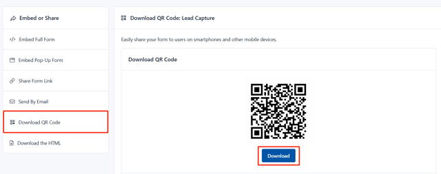
Step 7: Download QR Code
In this tab, you’ll find a QR code that links directly to the friendly URL of your form. You can easily click the “Download” button to save the QR code as an image, making it simple to print or share digitally with your clients — for example, on posters, flyers, or in your clinic.
Step 8: Download the HTML
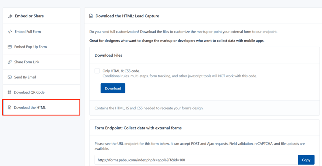
By following these steps, you can embed your forms into your website.
Where to Track Form Submissions
Once your forms are live and collecting responses, you’ll want to keep track of who’s submitted them and when. Here’s how you can view and manage form submissions:
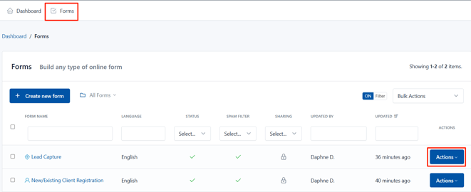
Step 1: Navigate to the Forms Tab
Navigate to the "Forms" tab on the top left corner to view your created forms. On the form you want to view the submissions, click the "Actions" button to view all available options.
Step 2: View Submissions
The actions button will reveal the "Submissions" option. Click to view the form submissions.

You’ll see all the submissions listed here. Each column gives you a quick overview of the form entries:
-
Submission # – The order in which submissions were received (starting from the most recent).
-
ID – A unique identifier automatically assigned to each submission.
-
DOI Status – Stands for “Double Opt-In”; this shows whether the client has confirmed their email (used mainly for consent tracking).
-
First Name – The first name of the person who filled out the form.
-
Submitted – The exact date and time the form was submitted.
-
Actions – Allows you to view or delete the submission.

To view the details of a specific submission, simply click on it to open and review the full entry.

Here you can also view the client or lead’s phone number, email address, and any additional fields you’ve included in the form.
The available actions at this stage include:
-
Comment – Leave an internal note visible only to your team.
-
Print – Print a copy of the submission.
-
Delete – Permanently remove the submission from your records.

By following these steps, you can view all your submissions.
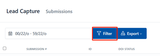
How to Filter Submissions
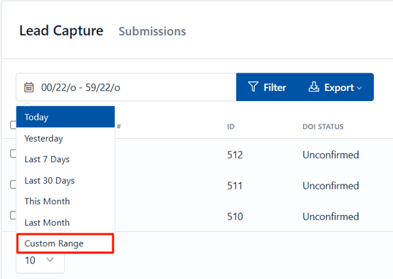
You can filter submissions by the date they were submitted. To do this, click on the Date field to select the date range you want to view.

You can filter submissions by the date they were submitted. Click on the Date field to get started— here, you can choose from preset options like Yesterday, Last 7 Days, and more. If you need a specific time frame, select the Custom Range option to pick exact start and end dates.
How to Configure Columns

This action will reveal a dropdown where you can enable or disable the toggles next to each column name to control which fields are visible in the table view.

The columns will update automatically as you toggle them on or off — no need to refresh or save.
How to Bulk Edit Submissions
To start bulk editing, tick the checkboxes on the far left side of each entry to select the submissions you want to update. To select all submissions at once, tick the checkbox at the top of the list.

Then, click the checkmark icon in the top right corner of the submissions page.

This action will reveal a dropdown with three bulk edit options:
-
Mark as Read – Marks the selected submissions as viewed, helping you keep track of what’s already been reviewed.
-
Mark as Unread – Marks the selected submissions as new or not yet viewed, useful for flagging entries that need attention.
-
Delete – Permanently removes the selected submissions from your records. Use this with care, as deleted submissions cannot be recovered.

By clicking any of these options, the selected action will be applied to all the entries you’ve chosen.
How to Configure Your Form Settings
Before sharing your form, it’s important to customize its settings to fit your clinic’s needs. From notification preferences to privacy options, these settings help you control how the form behaves and interacts with your system.
Step 1: Navigate to the Forms Tab
Step 2: Access Form Settings
The actions button will reveal the "Settings" option. Select to proceed with the configuration.

Step 3: Configure Settings
On this stage, you will view 3 tabs at the top of the screen. Let's start configuring the settings on the first tab. You will view the following options:
- Form Name: Displayed on the application administration pages and as the title of the form public page.
- Slug: This option allows you to customize your forms URLs. By default, slugs are created based on the name of the Form, but you can edit it here.
- Status: Indicates if the form is being shown. If set to Off, the form is no longer displayed to the user and instead appears a message indicating that the form is disabled and does not accept more submissions.
- Language: This language will be used to display form messages. For example, validation errors.
- Text Direction: Allows you to set the direction in which the values appear in the form. By default, the text direction is Left to Right (LTR). But, you can change the text direction from Right to Left (RTL) from the dropdown.
- Message: Sets the message to be displayed to the user when the form has been disabled (Off).
- Schedule Form Activity: Set the start an end date in which the Form must be enabled (ON) Before and after it, the form will be automatically disabled.
- Spam filter: Indicates if the form should use the honeypot technique to filter submissions made by real users from the ones made by bots (spam).
- Authorized URLs: To prevent a third party from embedding your Form on their own website, your form can be restricted to a list of URLs that you authorize.
- URLs: The domain names where the form can be embedded.
- Unauthorized Url Message: Enter a custom error message to be displayed when the form widget is embedded in an unauthorized domain.
- No validate: This option allows you to disable the Client-Side validation (by the browser). Take into account that the Server-Side validation won't be disabled. It's recommended to have this option in Off.
- IP Tracking: When this option has been enabled, IP addresses won't be collected by the application. You can enable the Browser Geo-location to collect the Sender information with consent.
- Analytics: Enable/disable monitoring the form by the application. When, IP Tracking has been disabled, Form Stats will be collected with IP anonymization.
- Autocomplete: Enables the browser's autocomplete to forms that have been previously filled. By default, this setting is ON.
- Save & Resume later: When this option has been enabled, the browser automatically will store the information entered by a user on each field to be resumed later, even if the user close the browser.

Step 4: Configure Confirmation Settings
This tab allows you to configure four key aspects of the submission confirmation:
- Inform to the user immediately: Whether using a text message (alone or above the form) or redirect the user to another web page. In the first case, you must type the message to display and in the second, the full URL of the web.
- If you'd like to make the message more personal, you can insert field variables (placeholders) into a confirmation message or confirmation URL, in similar way as a confirmation message by email. Once the form has been submitted, the placeholder will be replaced with the information placed in that field.
- To Redirect the browser to another page, you can set up 3 additional parameters
- Show Message and Redirect After: Here you can enter a number of seconds to start the redirection.
- Append Submission Data to URL: This is useful for small forms when you want to append all the collected data to the URL.
- Replace Field Name with Field Alias when it's available: If this option has been enabled, the collected data will be appended using the Field Alias.
- Conditional Logic With this tool you can customize the way that you handle and process your submissions, giving you more control once a user has submitted your form. A common example of this would be if you wanted to provide your end users the option to download a file. In this scenario you can redirect to the file to start the download process. But, if the user don't want to get the file, we will show the Thank You message.
- Send confirmation email to the user: If you select this option, each time a user submit a form will receive an email that will thank him.
- Double Opt-In You can enable the double opt-in feature to confirm your form submission. Then you can use the placeholder:
to present the link to the Opt-In Confirmation Page. When the end-user clicks this link can be redirected to another web page or see a custom Thank You message.
NOTE: When the end user confirms their Opt-In, the following event will be triggered: Email has been verified by double opt-in. This event can be used in different parts of the system, for instance to send email notifications.

Step 5: Configure Notification Settings
In this tab you can configure how Form Submissions will be sent to your email (All data, only a link to the data or a custom message). Additionally, you can set the email subject, email addresses and more.
- If the form has fields of "Email" type, you can select them as Send To and/or Reply To email address.
- If the form has fields of "File" type, you can attach uploaded files to emails.
- If you choose only Plain Text, a default message with all the submitted data will be sent in plain text.
-
You can choose the event when the email notification will be sent:
- Email is verified by double opt-in
- Form is submitted (New Entry)
- Form is submitted (Edit Entry)
- Submission is created
- Submission is updated

By following these steps, you can successfully configure your form settings.
How to Add Conditional Logic to a Form
Want to make your forms smarter and more dynamic without writing a single line of code? Pabau’s Capture Forms feature includes a powerful and intuitive Rule Builder that lets you add conditional logic easily. With this tool, you can show or hide fields, enable or disable inputs, perform calculations, skip pages, and much more — all based on the information your users provide.
What is Conditional Logic?
Conditional logic lets your form respond to the user’s input. For example, you can:
-
Hide or show certain fields only if a user selects a specific option
-
Automatically fill out or copy fields to save your clients time
-
Skip entire pages in multi-step forms based on previous answers
-
Do math calculations right inside the form, like totals or discounts
Step 1: Navigate to the Forms Tab
Step 2: Add Conditional Rules
To get started, click the "Conditional Rules" option.

Step 3: Create Rule
When you open the Rule Builder, you’ll see a blank space with an Add Rule button on the top right corner. Click it to create your first conditional rule.

When adding rules, the following components will appear:
-
Name/Description: Give your rule a clear name to help you remember what it does. (Optional)
-
Conditions: The triggers that must be met. You can require all, any, or none of the conditions to be true. Conditions can be grouped and combined in complex ways.
-
Actions: What happens when conditions are fulfilled — showing, hiding, enabling, disabling fields, copying values, performing math, skipping pages, and more.
For example, you can set a rule that hides the Submit button until the Name field is filled in. When you save this rule, the Submit button will only appear once the user enters their name.

Step 4: Add Condition
Adding conditional logic means you can create forms that adapt perfectly to each client’s answers, reduce errors, improve completion rates, and automate tasks. To add a condition, click the "+ Add condition" option.

A field will appear where you can edit the conditions by clicking on the fields and it will reveal a dropdown of options you can select.

Step 5: Add Actions
To add an action, navigate to the green "+Add action" button. A field will appear where you can edit the actions by clicking on the fields and it will reveal a dropdown of options you can select.

Types of actions you can use are:
- Show / Hide: Make fields or buttons appear or disappear.
- Enable / Disable: Let users interact with fields or lock them.
- Copy: Automatically fill one field based on another (perfect for billing/shipping addresses).
- Math: Calculate values using addition, subtraction, multiplication, division, and more — with results shown instantly.
- Evaluate: Use formulas to calculate complex expressions, including date calculations.
- Number Format: Format numbers (like currency) without coding.
- Text Format: Combine fields into formatted text strings (e.g., auto-generate email addresses).
- Skip: Jump between pages in multi-step forms based on answers.
- Form Actions: Submit, reset, or navigate pages programmatically.
Step 6: Add Rule
Once you've added the name, condition and action, you will find additional options on the far right side of the screen.
- Opposite Actions
Most actions automatically support opposite behavior. For example, if a rule says “show field X when condition Y is true,” then field X will hide when condition Y is false. This makes building logical, user-friendly forms quick and easy.
If you don’t tick the opposite actions option, the rule will only perform the specified action when the condition is met, but won’t reverse the action when the condition is not met. For instance, if the rule says to show a field when a condition is true, that field will stay shown even when the condition becomes false. Use this if you want more control and don’t want automatic toggling.
- Enabled
To activate a rule, simply tick this option. You can disable it anytime to pause the rule without deleting it.
To finalize creating the rule, go to the top right corner and click the green checkmark button.

By following these steps, you can successfully add conditional logic to your forms.
For more guides, refer to related articles below, select additional guides, or use the search bar at the top of the page. These guides will help you get the most out of your Pabau account.
Additionally, to help you fully utilize and understand your Pabau account, we recommend exploring additional guides and resources offered at the Pabau Academy. It offers in-depth video tutorials and lessons, offering a holistic learning experience that can equip you with the essential skills for achieving success with Pabau.